20111027
ARBURST_Jeremy Fish_Mark Moore Gallery
With Kenichi Yokono - Rise of the Underground
His new logo-like works are really inspiring.
One of our favourite artists, specially his illustrations. We like his surreal compositions based on classic cartoon imaginery and skateboard background.
Get there.
Etiquetas:
ARTBURST,
Jeremy Fish,
Kenichi Yokono,
Mark Moore Gallery
20111025
SUBSTANCE_Sherpa (I)
by 馬丁.
Sherpa-I
Marker on heavyweigh paper. 29,7x21cm. May 2007.
_
orders, suggestions, sales and enquiries please write us to:inFomochi@gmail.com
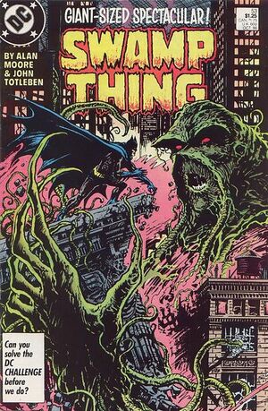
PULP AFFECTION_Double Magic: Swamp Thing vs. Batman
DC Comics.
by Alan Moore.
Creepy, scary, dark, romantic, Batman as invited guest...
...just in time for Halloween.
Etiquetas:
Alan Moore,
Batman,
DC Comics,
Double Magic,
PULP AFFECTION,
Swamp Thing
20111024
ARCHBURST_Japan Project

Book by OMA.

We like the idea of METABOLISM, or how to digest and approach architecture (life) from an apocalyptic starting point.

It sounds so familiar now...
POPMEAT_Star Wars Terrariums

by Susan Beal.
More pics here and step by step instructions here.
Have a look at the book World of Geekcraft, where it is included, here if you fancy making one of your own...
Etiquetas:
POP MEAT,
Star Wars,
Terrariums,
World of Geekcraft
20111021
SUBSTANCE_Inomochi Tag-4.
A couple of tag variations inspired by our friends in Dubai.

by inomochi
TAG4 (cards)
KRINK K-51, K-71 Markers on paper. 15x21cm.
October 2011.
by inomochi
TAG4 (blue)
KRINK K-51, K-71 Markers on paper. 15x21cm.
October 2011.
by inomochi
TAG4 (cracked)
KRINK K-51, K-71 Markers on paper. 15x21cm.
October 2011.
A brand new INOMOCHI logo tag.
From us to you with love.
_
Graphs: © inomochi 2011.
Pics: by Inomochi © 2011
orders, suggestions, sales and enquiries please write us to: inFomochi@gmail.com
Etiquetas:
Inomochi Tag,
K-51,
K-71,
KRINK Marker,
SUBSTANCE
PULP AFFECTION_ Progressive Covers: Pics + Ink

Invincible Iron Man Vol 1 #152.
November 1981
Marvel Comics Group.

Amazing Spider-Man Vol 1 #262.
March, 1985.
Marvel Comics Group.
Very curious now, and at the time, some of the first attemps to use mixed media in comic books back in the 80´s.
Etiquetas:
Amazing Spiderman,
Covers,
Invincible Iron Man,
Marvel Comics Group,
PULP AFFECTION
20111020
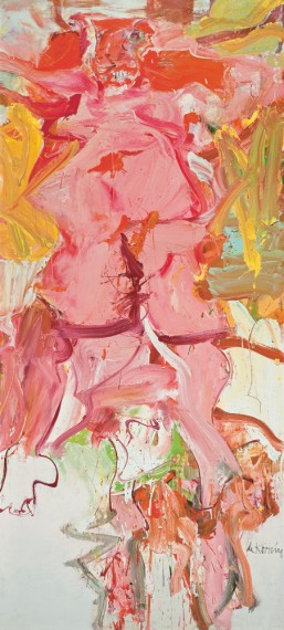
ARBURST_de Kooning ERASED by Bob Rauschenberg
Related to our previous post, we would like to recover one of our favourite works from de Kooning...
...whe he was remixed/erased by Rauschenberg 1953.
Because of the importance of de Kooning work relating abstaction, expresionism, gestural painting, etc... his work, specially the Woman I series was key to a big amount of American painters in the beginning of the 50´s BUT to some of his younger followers, such as Rauschenberg, his continuous shifting from figures to abstract colour fields and back again made him very difficult to truly "evolve" to moder painting.
To Rauschenberg eyes, de Kooning took the right direction and approach, BUT he was unable to get ride of the figurativism that he loved but knew had to discard to get to Modern Painting.
Therefore, Rauschenberg had to kill his father/master.
He asked de Kooning for one of his drawings "to be erased" and, with his authorization, he proceeded to erase the drawing.
By this, he achieved two things (that we find very inspiring):
- Reinforce the idea of abstract expressionism as a way to comunicate in modern way, by obtaining "ghostly monochromatic work without imaginery" through the process of erasing.
- Metaphorically erase de Kooning because, as a Master, he was "something" in the middle of the way to "progress", specially due to his reluctance to abandon the figure in painting.
We like the idea of obtaining new meanings and approaches through reworking previous finished work from another.
If you are interested, you can rad and excerpt in de Kooning biography, here.
Etiquetas:
ARTBURTS,
de Kooning erased by Rauschenberg,
SFMOMA
ARBURST_de Kooning Retrospective

September 18, 2011–January 9, 2012 at MoMa.
We like the process in his work of multiple methods, strategies and reworkings through time and works with different but coherent results along time...
Interesting techniques for us to explore:
- Pinholes vs smooth/rough surfaces.
- Drips over painting.
- Idea of "underdrawing", meaning the rough, ever-evolving sketch or basic idea for the work. Insistence on the process until you get where you want.
- Related to previous, changing the actual stretched sizeof the painting several times to achieve the desired composition
- Mixed media: charcoal and paint.
From figurativism to gestural abstractions, from landscape abstractions back to figures and to reductive abstaction again.
Come and go process to evolution through multiple strategies and reworkings
20111018
SUBSTANCE_Bonsai Labbit
by MV PRODUCTIONS - Inc.
Bonsai Labbit
Ficus Bonsai with Kozik Smokin Labbit Vinyl Toy. March 2008.
_
Pics: by Inomochi © 2008.
orders, suggestions, sales and enquiries please write us to: inFomochi@gmail.com
Etiquetas:
Bonsai,
MV PRODUCTIONS,
Smoking Labbit,
SUBSTANCE
POP MEAT_Dee and Ricky

LEGO bricks for fashion accessories.

Look carefully at Mr. Murakami´s bow tie...

Get inspired.

If so, you might need more ideas and pieces...

BUILD UP YOUR (L)EGO
20111017
LUDWIG WAS DEAF_Soft Metals 2011

We just got this from Phonica and, although we have seen this sleeve before and heard almost the same music 30 years ago, we can´t help but love them.
Techno nerd looking guy vs. sophisticated 80´s goth girl , black framed glasses vs. beautiful long legs, retro sessions (without the unbearable Mac), lots of black garments, backstage projections (no LED) , feather earrings and a huge collections of analog toys.
Our favorite is Voices.
We love them. Thats us.
Etiquetas:
LUDWIG WAS DEAF,
Phonica Records,
Soft Metals,
Voices
ARTBURST_Richard Serra Drawings Retrospective
Currently at the SFMOMA.
We like the idea of these raw drawings as part of the process of becoming sculptures, but also the pictorial qualities they have in themselves.

What is more, the relationship between his drawings and architecture is quite close to the type of dialogue we like to discover in the city via graffiti/street art.

In some ways, are quite similar to what we have been doing during the last ten years... is it possible to decode the sculptures and 3D models that lay within our raw, black inked, minimal drawings?

Interesting approach for inspiration and further works.
Seen in Juxtapoz.
Etiquetas:
ARTBURST,
Drawings,
Juxtapoz,
Richard Serra,
SFMOMA
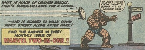
PULP AFFECTION_Double Magic: Marvel Two-in-One

This comes from Nak Attack, one of the World´s Greatest Comics Guru that has suggested us this...
... what else could we do but post it?
One of the weirdest and most interesting comic collections featuring The Thing plus one invited "artist".

We like the idea of strange combinations with unexpected results!
NAK ATTACK* KNOWS.
(...)
* PS: we are trying to convince him to provide us with post for our blog on a regular basis...cross your fingers and let´s hope he agrees!!!
20111014
ARTBURST_George Condo in Europe

After being exposed in NYC, the "European version" of George Condo retrospective MENTAL STATES is visiting Museum Boijmans Van Beuningen in Rotterdam and London Hayward Gallery.

Some ideas we like of this work:
- Different styles and technique approaches are able to define a whole body of work.
- Modern ideas and theming with "traditional" painting resources.
- Someone who grew in the 80´s NYC scene with Haring and Basquiat is (also) able to present a solid for-galleries work without being labeled with the "graffiti writer" tag (pun intended)
- In spite of the previous, he is able to collaborate in commercial projects, such as Sumpreme skateboard decks and Kanye West record sleeve without loosing any intensity as he gives the same importance to both the "official art" and the "consumer art".
- A pop American version of Bacon... and he is still alive!

Etiquetas:
ARTBURST,
George Condo,
Kanye West,
Mental States,
New Museum NYC,
Sumpreme Decks
20111013
SUBSTANCE_ ...and New Posters Coming Soon !!!
Currently working on this poster series, based on our Tag-3 design.
We are just finishing to choose the final colors.
One first and very limited edition of 5 original handmade designs on heavyweigh paper and a second edition of high quality prints signed by hand.
Our little tribute to SAMO© and Keith Haring.
We are just finishing to choose the final colors.
One first and very limited edition of 5 original handmade designs on heavyweigh paper and a second edition of high quality prints signed by hand.
Our little tribute to SAMO© and Keith Haring.
_
Graphs: © inomochi 2011.
Pics: by Inomochi © 2011
orders, suggestions, sales and enquiries please write us to: inFomochi@gmail.com
Etiquetas:
Inomochi Posters,
Keith Haring,
Limited editions.,
Posters,
SAMO,
SUBSTANCE
SUBSTANCE_Inomochi Tag-3...
by inomochi
TAG3 (Security Orange)
KRINK Marker and acrylic acetate. 29,7x21cm. October 2011.
Lately, it seems that we are just tagging furiously.
by inomochi
TAG3x2 (Security Orange)
KRINK Marker and acrylic acetate. 29,7x21cm. October 2011.
A brand new INOMOCHI logo tag.
From us to you with love.
_
Graphs: © inomochi 2011.
Pics: by Inomochi © 2011
orders, suggestions, sales and enquiries please write us to: inFomochi@gmail.com
20111010
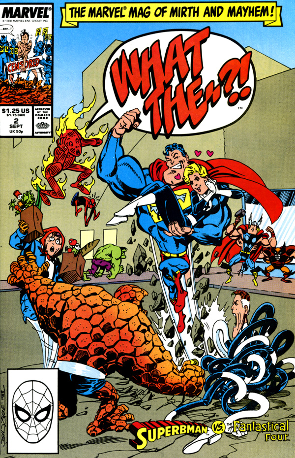
PULP AFFECTION_WHAT THE...? nr2

by John Byrne.
Marvel Comics Group
Sept. 1988.
We can´t add a single word about the author that haven´t been said already.
As usual, we like the more unknown version of one of the greatest pope in Comics Industry.
A great example of how to entertain and make fun of something that was originally created to be fun.
Under the lighthearted surface and gags there are second (and third) readings full of irony, criticism and pulp knowledge.
we like the idea of different meanings in 1988 and 2018, depending the reader´s comic knowledge and age and how it is fully enjoyable either way.
PS: And yes, it features Super(b)man in a MARVEL issue... :)
Etiquetas:
John Byrne,
PULP AFFECTION,
September 1988.,
What the...?
20111007
ARCHBURST_Steven Holl in Biarritz
We have aways liked Steven Holl work, but wat he has just done in Biarritz (by the way one of our favorite cities in France) defines perfectly our spirit and approach towards life and architecture.
His new building for the CITÉ DE L'OCÉAN ET DU SURF in Biarritz, France blends what we think architecture, modern culture, art, and lifestyle should be.
In this case, the content of the museum, its location and its shape is totally coherent with the function of the building (exhibiting sealife and surf contents).
But what has really interested us about this project is how Holl seems to take a step further and let people not just to contemplate and "see" the subject of the expo (in this case surfing) but also to "live" it through the inclusion of clearly skate ramp shaped roofs for the building. This roofs are perfectly defining by themselves not only the interior spaces for the exhibitions (looks like some kind of projections of surf films will take place there) but they also configure some kind of concrete frozen waves emerging to the exterior space, relating to the sea and all the action that takes place in it.
We haven´t been able to actually see any pics of people really skating there (in the roofs) , and probably, due to the "vandalic attitude" of the potential crew it might never happen (the rough paving doesn´t help, Steven) , but its the first step to understand architecture as part of its urban/natural enviroment and, in this case providing some interaction with the public via skating facilities.
In fact, this building is some kind of revenge for us, as this idea is something we have been fighting for since mid-nineties, usually facing ignorance and stupidity from the "official establishment".
So, you can go a step further as Steven Holl has done, or you can just spend the rest of your life spending others people money and boring your fellow citizens with bland and expensive boxes like this and pretend you are so creative.
You choose.
Etiquetas:
ARCHBURST,
Biarritz,
CITÉ DE L'OCÉAN ET DU SURF,
Steven Holl
Suscribirse a:
Entradas (Atom)


